About
A housing association in the South East of England building high quality, affordable homes for those in housing need.
A housing association in the South East of England building high quality, affordable homes for those in housing need.
Brief
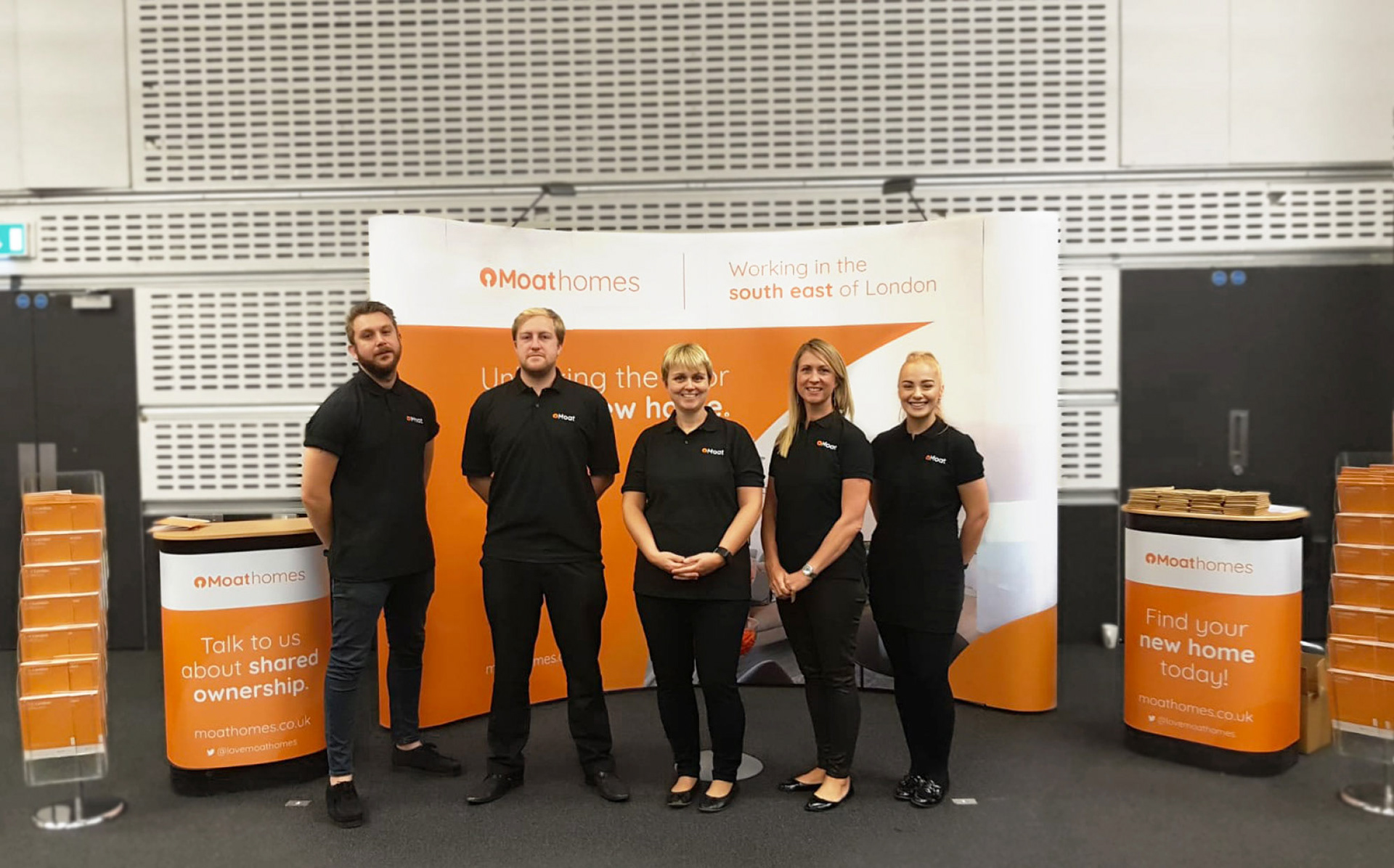
To re-brand Moat, Moat homes, Moat foundation and myMoat. To make the brand more approachable, friendly, affordable and professional while creating synergy between the arms of the master brand.
To re-brand Moat, Moat homes, Moat foundation and myMoat. To make the brand more approachable, friendly, affordable and professional while creating synergy between the arms of the master brand.
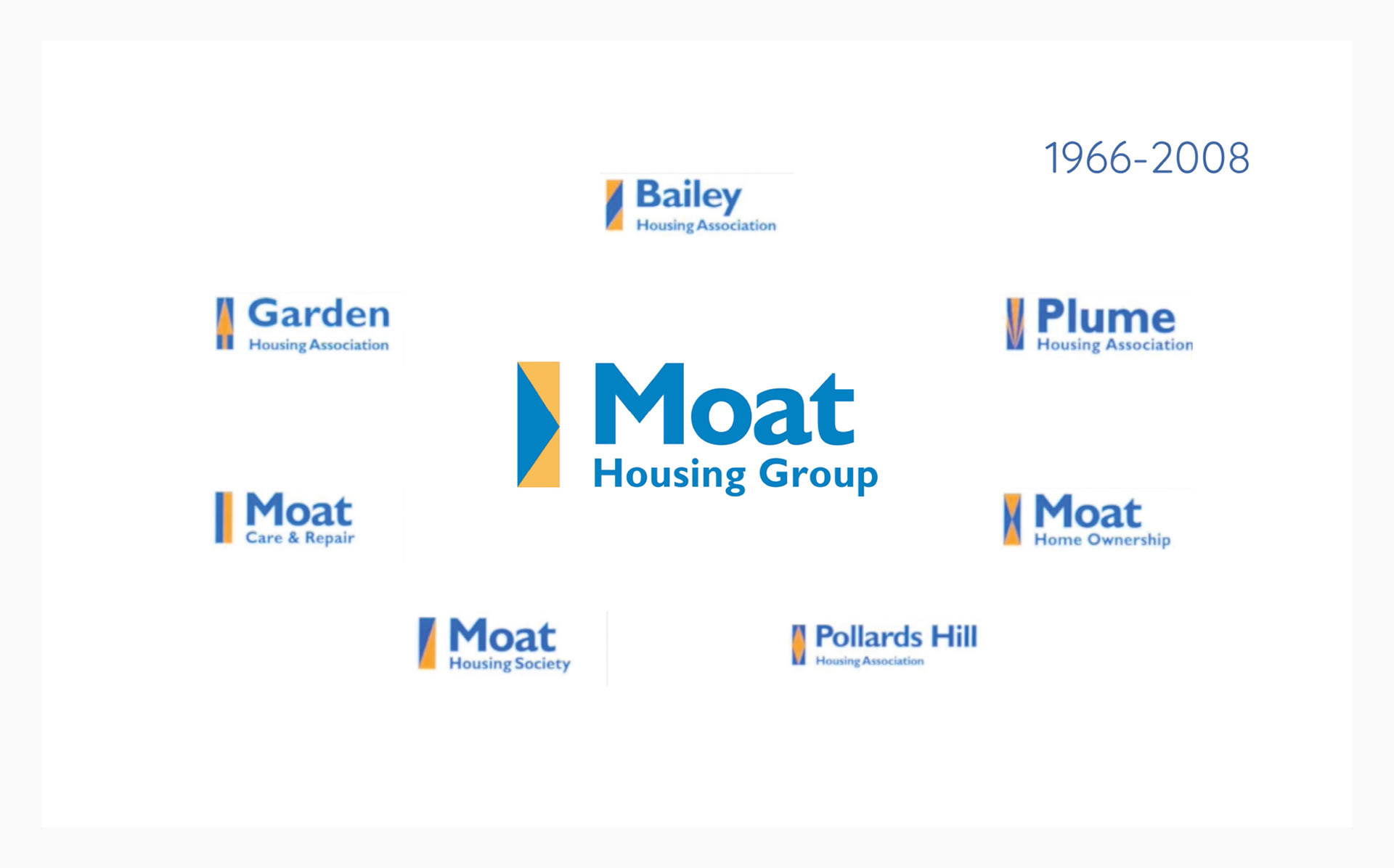
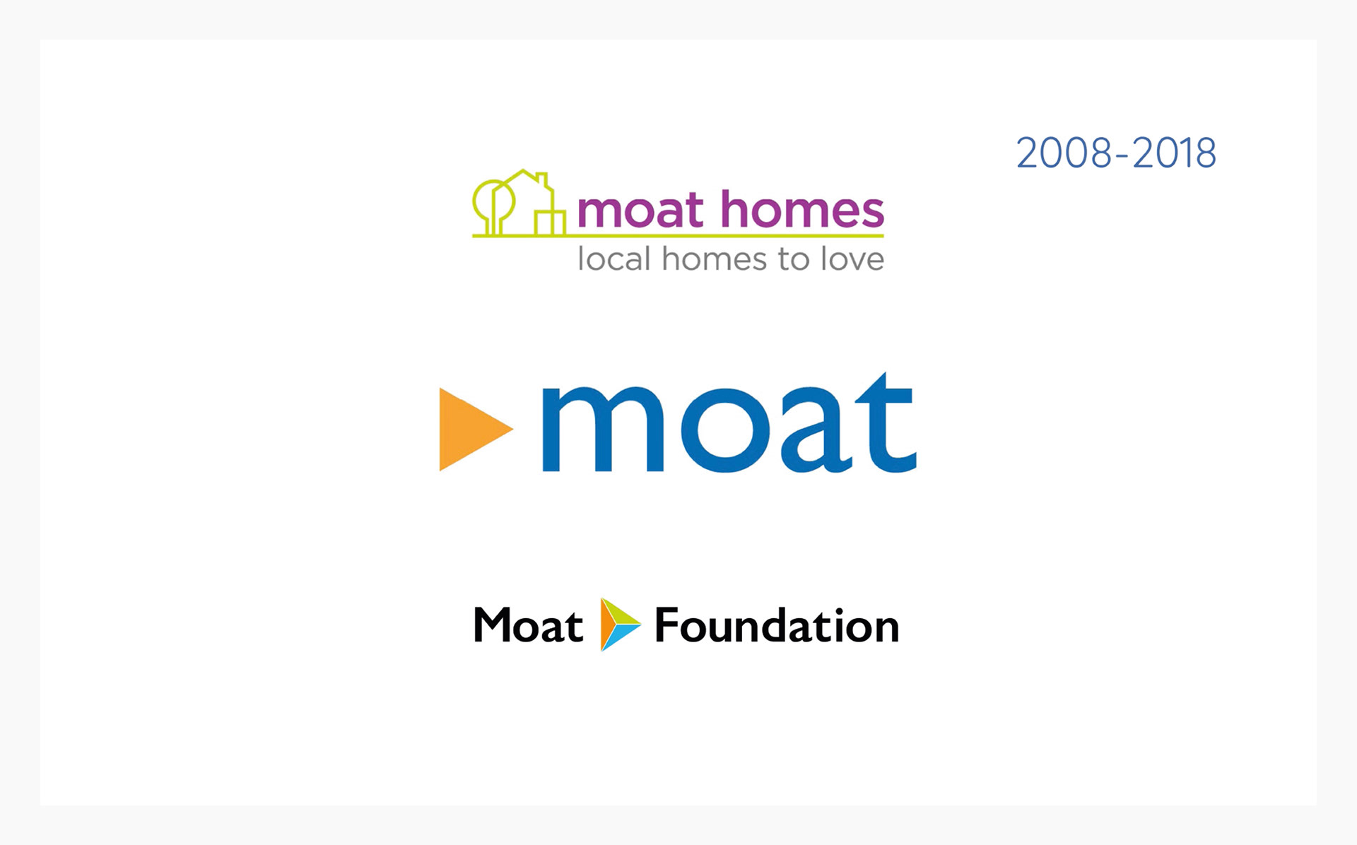
Working with Moat and having the job role to create brand identities for their new development sites, I immediately noticed the identity system for Moat itself didn’t match the companies tone of voice and values anymore. It was also very disconnected from its company arms; ‘Moathomes’ the sales and marketing side for new homes and ‘Moatfoundation’ a charity to help improve local communities.
They used to be 5 different companies that formed one to be called Moat. They used elements from all companies to form the brand. 10 years on with the brand more established the relevances of the identity was due to be re-looked at.
They used to be 5 different companies that formed one to be called Moat. They used elements from all companies to form the brand. 10 years on with the brand more established the relevances of the identity was due to be re-looked at.
After doing marketing research to understand more about the company and what was most iconic about the current brand, it was clear the combination of the two colours orange and blue. It was important this was carried out throughout the re-brand.
Logo
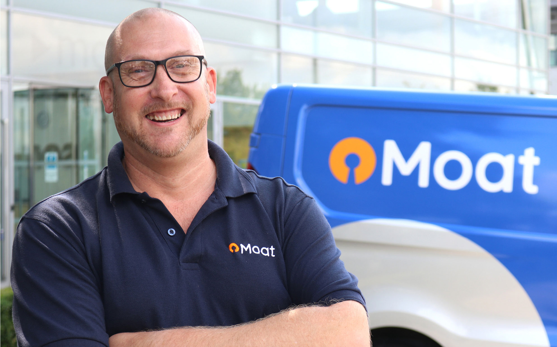
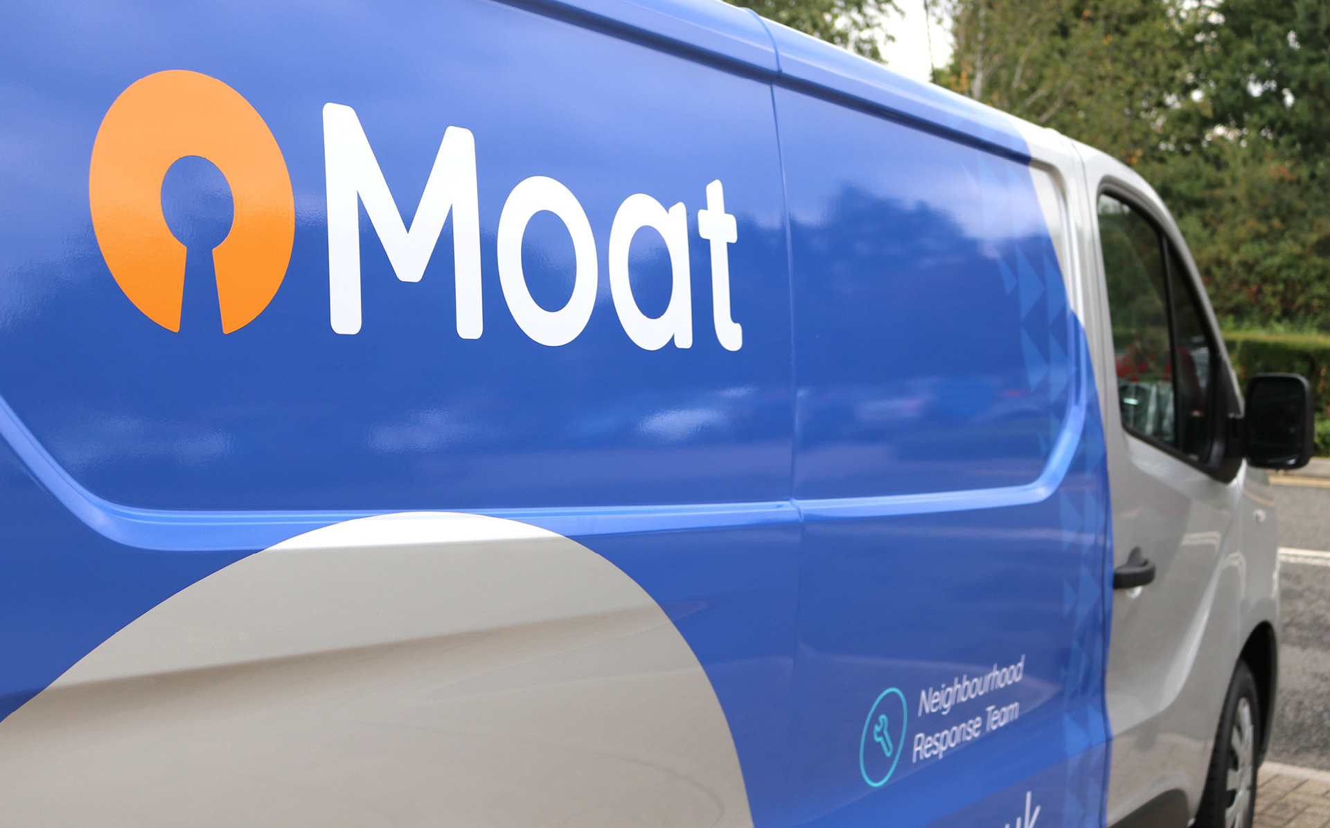
Creating an evolution of the brand it was important to keep this refresh recognisable. I wanted to create a symbol that has deep meaning and connection to the company and its name. So coming up with an icon that represents a Moat surrounding a castle and a keyhole lent itself to the name. The text has been customised from the typeface Quicksands. I reduced its curves and thicken the lines to get that balance of friendly yet professional feel.
Creating an evolution of the brand it was important to keep this refresh recognisable. I wanted to create a symbol that has deep meaning and connection to the company and its name. So coming up with an icon that represents a Moat surrounding a castle and a keyhole lent itself to the name. The text has been customised from the typeface Quicksands. I reduced its curves and thicken the lines to get that balance of friendly yet professional feel.
Pattern
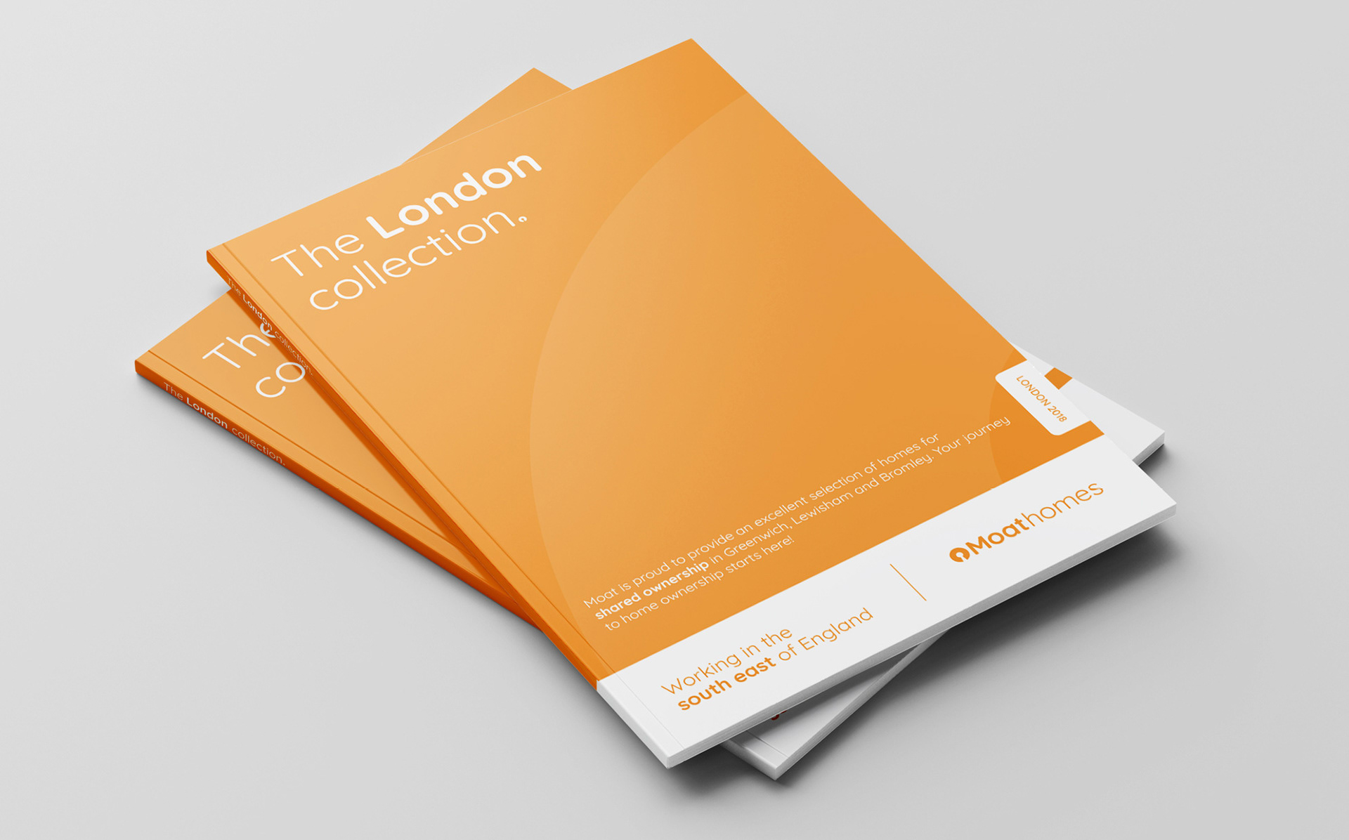
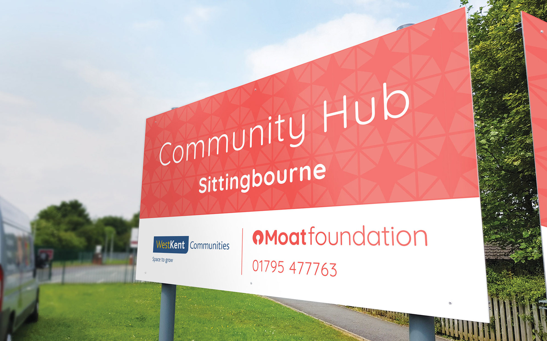
We carried the old identity with its triangle symbol on by creating each pattern using the triangle. Moat having the symbol repeated. Moathomes having homes. Moatfoundation having triangles formed together representing bringing communities closer.
We carried the old identity with its triangle symbol on by creating each pattern using the triangle. Moat having the symbol repeated. Moathomes having homes. Moatfoundation having triangles formed together representing bringing communities closer.

Primary Colours
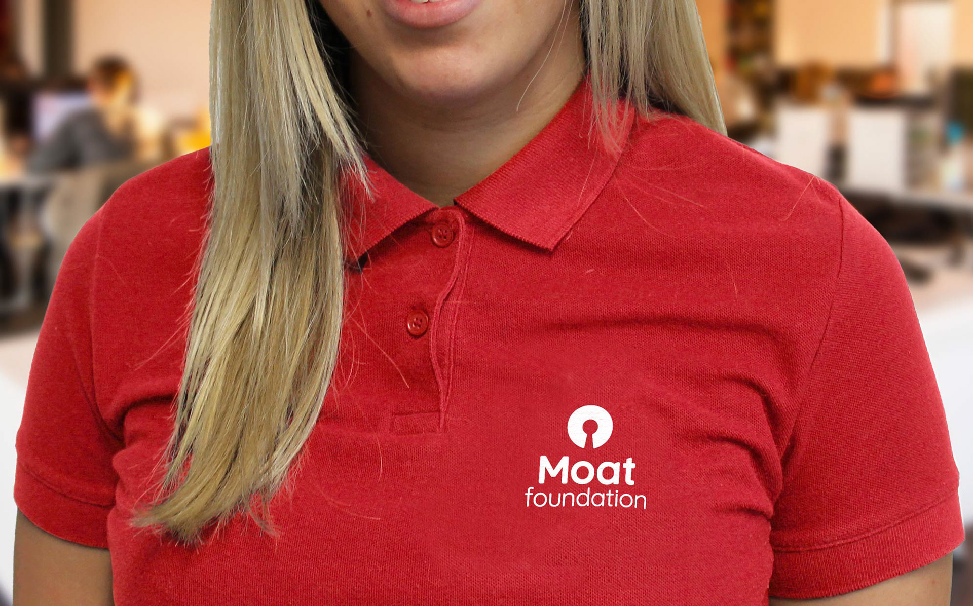
The refreshed blue is more towards navy giving a more professional feel while the orange being more of a stronger and richer colour injects more of an informal approach getting a balance of Moat’s core values. Although a red colour for a charity like ‘Moatfoundation’ might be an obvious choice, it needed to be instantly recognisable this is Moat’s charitable arm of the company. This red is a soft red with a touch of pink making it more friendly and approachable.
The refreshed blue is more towards navy giving a more professional feel while the orange being more of a stronger and richer colour injects more of an informal approach getting a balance of Moat’s core values. Although a red colour for a charity like ‘Moatfoundation’ might be an obvious choice, it needed to be instantly recognisable this is Moat’s charitable arm of the company. This red is a soft red with a touch of pink making it more friendly and approachable.
